Showing posts with label Paint colors. Show all posts

February 10, 2016

Lovin' Me Some PINK!

You already know I'm a "pink" girl, right?  Well, look how a few coats of PINK paint transformed these mirrors! This trio of mirrors surely adds the WOW factor here...along with these beautiful pink flowers.  Accessories are the jewelry in any room...so why not add pzazz into your decor using colors you love! 


Make it a "Simply Irresistible" Day!
Till next time...


Image Credits:  BHG

*I TRY TO CREDIT ALL IMAGES, IF THERE ARE ANY PHOTOS OR IMAGES HERE THAT ARE NOT CREDITED CORRECTLY OR YOU WISH THEM TO BE REMOVED, PLEASE LET ME KNOW AND I WILL GLADLY OBLIGE. THEY ARE BEING USED HERE FOR THE SOLE PURPOSE OF DISCUSSING INTERIOR DESIGN. THANK YOU!

August 22, 2012

Pantone Predicts!

In case you missed it...here are the color predictions for Fall 2012.  We all remember that Tangerine Tango was the hot topic and pick for the color of the year, right?  Now, take a look a these other luscious picks for Fall.  I have to say, this year there are several that I adore!


So what are your thoughts?  Do you see any that you'd love to try in your home....or fashion this Fall?  Do tell, we'd love to know.

Oh and remember, if you need help getting your home ready for this new arrival (Fall, that is!) just let us know and one of our designers will be in touch!

Have a "Simply Irresistible" Day!


Image Credits:  Pantone

*I TRY TO CREDIT ALL IMAGES, IF THERE ARE ANY PHOTOS OR IMAGES HERE THAT ARE NOT CREDITED CORRECTLY OR YOU WISH THEM TO BE REMOVED, PLEASE LET ME KNOW AND I WILL GLADLY OBLIGE. THEY ARE BEING USED HERE FOR THE SOLE PURPOSE OF DISCUSSING INTERIOR DESIGN. THANK YOU!

September 12, 2011

Color Splash

I hope you all had a great weekend! I know that most of us probably had the 9/11 tragedy on our hearts and minds yesterday.  I know I did and I prayed for those families many times throughout the day.


We have some renovations going on in our household right now.  This kept us pretty busy over the weekend.  With painting now underway and some areas completed...it is so nice to stand back and see what a fresh new coat of paint can do!  Whether you change the colors, or just apply a fresh coat, it is such a change.  I did change colors and now I have a lovely back entrance and hallway done in HUMBLE GOLD by Sherwin Williams.  Here is the sample color...


Keep in mind, my dining room is now done in VALENTINE (also SW)...which I believe I shared earlier with you...


I will also be adding a blue/green somewhere along the way too.  I haven't made the exact selection yet (have three or four I like!) but this one will give you the idea of my new color scheme...


Then, the fun part will be adding accessories to enhance my new color scheme!  I am so excited to finally be making a change for ME!  I love helping clients make all of these changes, but truth is, I never seem to find the time to coordinate and plan all the changes for myself.  Sad, but true!  Just being honest here.

So, with that being said, and the fact that I always use Sherwin Williams paint (I just love their paints and the service we receive!) I wanted to share this short video with you about their HGTV line of paint colors...Click Here 

Enjoy and Have a "Simply Irresistible" Day!
Ta-Ta!


Photo Credits: Sherwin Williams

July 6, 2011

Painted Ceilings

Since we talked about painted hardwood floors yesterday, I thought it would be appropriate to now...look up...at our ceilings, which take up as much space in the room as our floors.  Have you ever really thought of that?  The days of basic white ceilings has passed us by.  It's true!  In our design business I don't feel like the room is complete until the ceilings have been considered into the design plan. They should never be overlooked, just as any other element in your room shouldn't be overlooked. Whether you go a few shades lighter in color than on your walls, a few shades darker, or decide to "pop" an incredible different color...it will make a huge difference in the overall look and feel of the room in the end.  Now, this is not to say that you can't have good design with white walls and/or white ceilings...you can, but adding a little color up top is also a great idea. Let's take a look to see what I mean...


ceiling picture veranda
This scrumptious blue ceiling certainly does the trick to bring the eye down and makes it feel a part of the "total package" here. Complete serenity here, wouldn't you agree?

Photo from Traditional Home.
Here a lighter shade of blue is used to contrast a bold black and white pattern on the floor.  

Another example of same thing done (and look at that "pop" with the green chair and green bucket for the pens and pencils!!)

black-ceiling-elle-decor
How about this very dramatic effect with a black ceiling...along with  black trim and black also on the floor.  Do you like?  It is actually balanced out with white on the walls here.


I think this combo is heavenly with the dark floors, b/w wallpaper, and then topped off with a yellow ceiling. Notice that the ceiling color used here is slightly lighter than the shade of yellow that is used in the draperies and accessories.  

Talk about POP...here it is.  A huge color effect to this otherwise white room!  See how the purple was also carried out in the artwork on the wall...and again on the table top.  Remember the good rule of thumb...repeat the color at least three times in the room!

Here is yet another huge pop of color on the ceiling, that just happens to be purple as well.  I see the color repeated again in the chair cushions....where else do you suppose they added it in?

Ah...and here's a bit of our patriotic colors (how appropriate for this week!).  I simply love the boldness of the blue on this ceiling, which is a lighter shade of the throw pillow.  I would bet that the same blue (as in the pillow) is used for the dust ruffle on the bed...or maybe chairs in the room.  Can you tell how adding a color on the ceiling just throws in a whole new "look and feeling"...as opposed to just a plain white ceiling? Imagine this ceiling as white...which would YOU prefer?

This room in designed in basically the same color...just using differing shades of the color throughout....what do you think?  Like or dislike?  Or do you prefer the use of other colors with it?  Just curious about YOUR tastes!

OK, here's your chance...showcasing a third color, in contrast to the others, on the ceiling...and in high gloss I do believe. I do see the color repeated in the artwork and I'm sure it is used elsewhere in this room too.  Talk about a bold statement on the ceiling....whew!  Any thoughts?  I'd say this one is a "high energy" room for sure. Me personally, I could handle the colors in the room very well, but I couldn't take the boldness of this color used on the ceiling. Now that's just my personal design preference!

Kid's rooms make a great place to add a little spice to the ceilings.  I love the simple stripes in white, brown and green here that is then accented with the blues around the room.  I especially like how the green is used on the back wall of the shelves...as it pulls that green down from the ceiling to eye level as well. This is a room any kid would enjoy!

I hope you enjoyed looking at painted ceiling ideas today.  See how important it is to include the ceiling in your design plan from the beginning? It will make all the difference in the world to the final outcome and feeling of the room too.  If you are still unsure of how to coordinate your colors in the room, be sure to invest in an interior designer.  It will be well worth the investment! Let us know if we can help you.

Make it a "Simply Irresistible" Day!  


Photo Credits:  Veranda, Southern Living, Elle Decor, Sherill Canet, Sara Story, Making Arrangements, HGTV, Margaret Donaldson, House Beautiful


*I TRY TO CREDIT ALL IMAGES, IF THERE ARE ANY PHOTOS OR IMAGES HERE THAT ARE NOT CREDITED CORRECTLY OR YOU WISH THEM TO BE REMOVED, PLEASE LET ME KNOW AND I WILL GLADLY OBLIGE. THEY ARE BEING USED HERE FOR THE SOLE PURPOSE OF DISCUSSING INTERIOR DESIGN. THANK YOU!

March 24, 2011

Let's Do...Lavender!

Ah...Spring time and the fresh scent of lavender...heavenly! I wonder if this color could bring a luscious feel to our designs?  I do believe it can. Lavender, the herb plant, is known for it's relaxing and healing properties. I think it can have the same effect on our room design.  Lavender is usually associated with shades of blue, but can be found in various hues in our fabrics, paints, accessories, etc.  I love pairing this heavenly color with...cream or white.  With white, it just gives the room a clean, crisp feel. When put with cream it creates a 'feel of elegance'. What color would you try with it? We'll take a trip to several rooms and see the varying hues and styles...and of course, see how this color makes YOU feel.


Lavender Rows - how lovely!


Who's up for a scrub in this 'yummy' tub? I sure do hope the little yellow rubber duck is in there...to go with that bright yellow shower stall - Ha! Ha!


Lavender subway tiles in a white Christopher Peacock kitchen


Scrumptious!


The look of  'elegance' to me!


Stunning...don't ya think?


495-Lavender
Love it...Love it!  This is a pic of a restored Rufus Porter mural in the Moses Mason House. 

What are your thoughts on this color of the day?  Do you love it? Unsure about it?  Or, simply do not care for it?  I'd love to know your opinion.  Oh, and ladies...you do know this is also a popular color for nail polish this year, right?  So, let's do...lavender!


As always...thanks for stopping by.  Now, go make this a "Simply Irresistible" Day!  Ta-Ta!


Photo Credits: Flickr, Traditional Home, House Beautiful, House and Home, Anne Coyle, Apartment Therapy, forhomeinteriordesign, Charlotte Moss, Christopher Peacock,  1interiordesign, Country Living,  Paint Style, Essie, OPI.

*I TRY TO CREDIT ALL IMAGES, IF THERE ARE ANY PHOTOS OR IMAGES HERE THAT ARE NOT CREDITED CORRECTLY OR YOU WISH THEM TO BE REMOVED, PLEASE LET ME KNOW AND I WILL GLADLY OBLIGE. THEY ARE BEING USED HERE FOR THE SOLE PURPOSE OF DISCUSSING INTERIOR DESIGN. THANK YOU!

March 23, 2011

"Wildcard Wednesday"...in Living Color!

Are you ready to "liven it up" a little with our "Wildcard Wednesday" color of the day?  I surely do hope so because today's color choice is...Tangerine!  Some magazines have even named it to be "one of Spring's hottest colors for 2011". Although tangerine is a very under-used color, it can be simply stunning with whites or creams. Remember, you can always introduce this amazing color one piece at a time...or all the way.  Sit back and let's take a look!


barbara barry's office
One simple piece can brighten the entire area!

Tangerine and Gray Dining Room - Traditional Home
Look how stunning it is here with gray, which can be an otherwise drab color by itself.

Tobi Fairley Melon Buffet
Look how well it goes with other colors like yellow, green and even blue.
.
Tobi Fairley Orange Bedroom
Now this would brighten anyone's day!

A game room done in tangerine.


Zuniga Interiors contemporary living room

Just a little "pop" is all it takes...gorgeous with this white!

Tangerine is many times used in tropical villas.


Simply lovely when paired with soft blues!


How about a little office nook with a splash of this wild and wonderful color?


Are you convinced now that tangerine is the color you need? Don't let the 'bad rap' of the 70's keep you from using it in your decorating now. Orange hues are considered bright and energetic, while some of the newest textiles are showing orange in color combinations and patterns that are much more sophisticated. There are tailored stripes combining tangerine with cream and gray, as well as graphic prints that combine this color with many other citrusy colors for a more "pop art" style. This delicious color can be worked into most any style there is. 

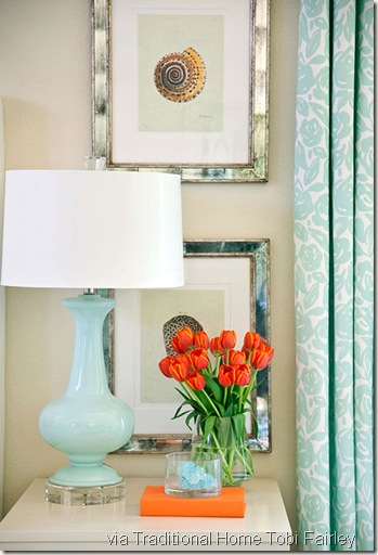
One no-fail tip when decorating with tangerine is to put it with colors found beside it in nature itself.  In the Spring, this may include fuchsia, lime green, persimmon, or even baby blue for a delightful flair of color.  As we've said before, when using any bold color, be sure to use the right amount and the right intensity.  Don't overdo it, especially if orange is not a 'fave' color of yours. Tangerine will certainly add a little freshness to your space...so why not give it a try!

Here's a sampling of a 'mood board' done in tangerine...

Compliments Tobi Fairley

So... as you go about your day trying to decide how you may introduce this color into your lifestyle and home...be sure to also make it a "Simply Irresistible" one.  Ta-Ta!

Photo Credits:  House Beautiful, Southern Accents, Tobi Fairley, Southern Living, Villas in Jamaica, myhomeideas, Traditional Home, HGTV, Coco+Kelley, Bright,Bold and Beautiful, Drake Design, Houzz LA.

*I TRY TO CREDIT ALL IMAGES, IF THERE ARE ANY PHOTOS OR IMAGES HERE THAT ARE NOT CREDITED CORRECTLY OR YOU WISH THEM TO BE REMOVED, PLEASE LET ME KNOW AND I WILL GLADLY OBLIGE. THEY ARE BEING USED HERE FOR THE SOLE PURPOSE OF DISCUSSING INTERIOR DESIGN. THANK YOU!

March 22, 2011

Welcome Spring! (Yellows)

As we continue the series on color, today’s subject is...Yellow. Have you had a chance to spend some time outdoors?  If so, I'm sure you have found plenty of this "happy" color around. I’ll be exploring the use of yellow, showing you some colors that will work with it, and we'll see if this color takes YOU to that "happy" place emotionally (seriously, it's known to do that). If you've considered trying yellow in your home, this might get you started….


What are some characteristics of yellow?

In it’s purest form it is a cheery, strong,"sunny" color that can remind us of a sunny day at the beach.  Yellow brings with it a comfort and a sense of warmth in a way that the stronger warm colors of orange and red can't.  I always think of yellow as a happy color,  In our designs here at Alpha and Omega Interiors, we find that shades of the deep, warm golds are most popular.  Our clients seem to be able to live with this color much easier than with some of the other shades of yellow. However, everyone has their own taste and preferences...so let's take a look!


FYI Tuesday Tidbit...
A lovely yellow/gold we are known to use by Sherwin Williams 
SW 6380 Humble Gold
(photo didn't do it justice...so go pick up a sample at your local store)


Banana Cream

Here we have all the makings of a classic and elegant room. This room simply overflows with "sunshine" and light with this bright shade of yellow and variations of ivory.  Notice that these colors are taken right from the room's artwork, makings this a very cozy and inviting space.  How does this room effect you emotionally?

Now, just for fun...let's stop and take a look at this same room done in two other colors and see how differently each effects you?  You will see that this concept is true...colors do effect us emotionally!

Here is the same room, but in chocolate brown with yellow and gold accents

Chocolate Brown (Promo)

These rich brown walls create a sophisticated space.  The use of neutral furniture, lamps, and accessories keeps this area from feeling too closed in. With the walls painted this chocolate brown, the designer accented in yellows and gold with the  painting (same one as previous room), pillows and a throw. The ivory lamps and plates makes a wonderful collage for the focal point all while keeping this room "light and airy"...even with a dark color on the walls. Now, does this same room, in this color, effect you differently?  How?


Next, same room again...in a tangerine palette.

Tangerine Orange

Citrus hues lend a tropical feel to this room...do you feel it?  If you want to spice things up a bit, then by all means, this citrus hue of tangerine, with lemon, lime, and coconut brown will give you this tropical, fun feel. Did you notice that it is not only the same room once again, but the same furniture and artwork as the two other rooms we just looked at...yet done in these colors it yields a whole new, fresh feeling. What do you 
think about this one? 

I hope this helped to show you that the colors used in your home do indeed have a personality and a mood altering effect.  Now let's continue looking at some designs in yellow.


Simply beautiful...


Yellow living room
I love how this entire room "feels" just like that painting above the sofa.  The color scheme is pulled from that painting for the whole area.  The yellows seem to "pop" that artwork scene even more.  Such a nice overall effect in here!


Here is a lovely vintage look!


Notice how this room was pulled together from the artwork with the golds mixed with the use of brown, greens, and blues.


Gray and yellow again combine for a striking look - notice the yellow continues outside. (via MarthaStewart.com)
Don't want to jump in with an entire room in this color...then accent some bookcases with it and add in throw pillows for a great refreshing look!


A fresh, cheery kitchen opens into a sunny breakfast nook. What a great way to start a day! (via Real Life Decorating, BHG)
Yellow can do wonders for a kitchen too by bringing the sunshine in.  And don't you just love this antique piece used as an island in here? This is indeed "Simply Irresistible" (and a great idea for you)! And then of course, there is this painted floor, but for now let's stick with the color of YELLOW!


Used with browns for a sophisticated, restrained bedroom (via Coastal Living)
What an elegant, yet laid back cozy feeling, this room has with the use of varying shades of yellow and gold along with the chocolate browns.  Is this the same "feel" you get with this room?


Sharp and full of contrast this combo of yellow, black and white is very current. (via Freshome.com)
A punch of a brighter shade of yellow for a more bold, classic look.


These are actually pale yellow walls, so pale it almost looks cream.  This is a great way to go if you really don't want to play up the color on the walls much, but just want a subtle change. Then you can play up the yellows in the draperies, throw pillows, as well as a few select accessories.

..

Yellow and Pink Living Room
For those that know me....you know I love this one! We have quite a bit of yellow along with pops of lime green and pinks....."Simply Irresistible" in my book! This is such a cozy and cheerful room that I might never want to leave it! This would indeed be my HAPPY place! I love how this room was grounded with a rug in white (ties in with trim, coffee table, and table chairs).


Or...why not at least try pops of color with flowers or accessories!  This would be an easy way to introduce a bit of sunshine into any area of your home for Spring.


How's this headboard for luxury?  And what a "pop" of cheerful yellow!


Yet another look using yellows with stripes.  This has a cottage "feel" to me! 


A small touch of yellow...is this a statement or what?


How about these bright re-purposed barn doors instead of a standard door...?  I think this is quite stunning really....and the same shade of yellow used in the bedding.  I'm even loving this one!


Remember...you can always add in a ray of sunshine with a painted piece of furniture!  This is an easy idea, but what a WOW factor it is!


Here is a soft, gentle and peaceful room bathed in yellow with soft accents in green...lovely!

I know I have given you a lot of designs in yellow today, but it's such a cheerful color that I couldn't help myself!  I'd love to hear how this color effects you and if you would now consider using it in one of your rooms. Remember, if you need help designing your "new look" our design team is here to help with our local and out-of-town design services. We can get from you the "feel" you want and then create a design plan for you to follow in order to create your dream room...easily and in your time frame... and of course, within your budget.  Please be sure to let us know and we will get in touch with you.

Be sure to have a cheerful day and spread some of that cheer around to others...THAT will make it a "Simply Irresistible" day for sure!  Ta-Ta for now!


Photo Credits:  Southern Living, Architectural Digest, Coastal Living, Living Etc., Elle Decor, Make it Pop, House Beautiful, Country Living, Freshome.com, Better Homes and Garden, Marthastewart.com.

*I TRY TO CREDIT ALL IMAGES, IF THERE ARE ANY PHOTOS OR IMAGES HERE THAT ARE NOT CREDITED CORRECTLY OR YOU WISH THEM TO BE REMOVED, PLEASE LET ME KNOW AND I WILL GLADLY OBLIGE. THEY ARE BEING USED HERE FOR THE SOLE PURPOSE OF DISCUSSING INTERIOR DESIGN. THANK YOU!