August 31, 2011

Painted Backs in Bookcases

I just love the look of painted backs in bookcases.  Have I mentioned that?  It is such a great way to add a pop of color to any room!  This can also be a good option for those of you that aren't daring enough to put bold color on your walls.


The color used here is a bold one in the same color family as the chair, flowers and even the rug.  I love how it pops the color to make a huge impact in the room and ties everything together.


Here is a much softer and lighter color, yet it still adds an impact and changes the look.  It picks up the lightest color in the wall hanging, I do believe...which is always an easy way to choose a color.  You can probably just select a color in your wallpaper or fabric to add to the bookcase.


A little flair here for all of you modern ones out there...but I surely love the colors (I know you know that by now, right?).  Three different shades of pink are used in these bookcases.  Do you like or dislike?


Here is another example of painted back bookcases that I dearly fell in love with...not only because of the paint color used, but also because of the way it was accessorized.  Isn't it just lovely?


image
Painted backs can do wonders for the kitchen too.  I love this shade of blue used...it reminds me of the calming sea (and with this white subway tile...well that's "Simply Irresistible" to me!).


image
I think this black bookcase is stunning with the painted back...wouldn't you agree?  Using this neutral tones it down yet adds such drama to the room. 

I love the cottage charm of this room with the emphasis on the back of this bookcase.  Imagine if the back were white...would it give the same effect to the room?  Nope, it wouldn't at all.


Aren't these painted backs that flank the fireplace lovely?  It just makes such a difference and, to me, it even makes the room look larger.

Well, it seems we had alot of blue painted bookcases this time. What would be YOUR "go to" color if you were to paint a bookcase?  Would it be a soft, light color....a bright and bold color...or a neutral?  Keep in mind this is an easy way to transform a room and give it an all-together new look and feel.  Just be sure to select a color that works with your other things in the room and "go for it"...or you can always consult with a designer to help with color selections!  My guess is you'll be pleased.

Have a "Simply Irresistible" Day!
Ta-Ta!


Photo Credits:  Martha Stewart, Porter House Designs, Laurenscape, House Beautiful, Developing Designs, Elle Decor

*I TRY TO CREDIT ALL IMAGES, IF THERE ARE ANY PHOTOS OR IMAGES HERE THAT ARE NOT CREDITED CORRECTLY OR YOU WISH THEM TO BE REMOVED, PLEASE LET ME KNOW AND I WILL GLADLY OBLIGE. THEY ARE BEING USED HERE FOR THE SOLE PURPOSE OF DISCUSSING INTERIOR DESIGN. THANK YOU!

August 30, 2011

Essie Fall Fashion Colors

Well, as we said before...Fall is almost upon us.  With it brings a whole new color scheme to some things like clothing, accessories, make-up and...nail polish.  To be honest with you, I always seem to dread it for this very reason.  I just love more of the summer colors and I am not a lover of any Fall colors really...maybe with the exception of some tones in the red family (those with a hint of PINK, no doubt!). I don't even enjoy shopping for Fall clothes (lame, huh?) because I usually just don't like the "colors".  I am just being honest about myself here.  If any of you are like this, I'd love to know!  I usually end up with just black, ivory/cremes and deep pink/red tone fashion items.


Now, back to my topic for today...nail polish for Fall this year (drum roll please!)...Here are the new colors from Essie.


0821-essie-fall-2011-nail-polish-collection_bd.jpg
Their Fall 2011 collection was inspired by 1940's and 1950's handbags so the colors are both sophisticated and ladylike (per Glamour's fashion statement).

Top one is a dark green, (going clockwise) next is an almond blush, working into the mulberry merlot (one I think I could go for!) and the demure pink (hey, another one I would like), then a rich caramel beige and creamy burnt sienna.  So there, we have it, they new Fall lineup for Essie nail polish.  These should be available in stores this month...which means they could be there now.  What do you think of these new colors?  Are they for you?  Are you ready to switch your wardrobe out for Fall?  Tell me your helpful fashion secrets...I'd love to know!

Thanks for stopping by!
Have a "Simply Irresistible" Day!


Photo Credits:  Glamour.com

August 29, 2011

Bench Fascination

Happy Monday fellow readers!  So glad you could join us today.  I have had a big fascination on benches lately...yes, benches.  There are so many places that these will work in the home, so many styles, finishes, sizes...etc.  Let's just take a look at some of them here today, OK?


I love a red bench...that "pop" of color on this fascinating little piece of furniture can do wonders for most any area.  Couldn't you see this  in your kitchen area ... or... perhaps inside the back door area?  Depending on your style you could even put it in the foyer area.  It would be a "welcoming" sight in most any place...don't ya think?


Here is an upholstered bench that is a simple style, yet could be worked into most any design style.  It would be great extra seating for the great room...or even the master bedroom. How easy to add the throw pillows to coordinate with any area of your home.

What about these benches added around this farmhouse table?  Like it?  I surely do.  Take a look at this kitchen area...actually it is mostly on the modern side of style...and yet this farmhouse table was incorporated in with it. Having these benches around it brings together that great blend of "country" and "modern".  How often do you see pairs of benches around a table?  Not often, right?  It's always good to think outside of the box!


Here is a bench with more exposed legs but also with a cushion.  I love benches that are as wide as the bed...lovely!


Another style bench that can be used most any where.  I even love it here at the foot of this bed too!


Perhaps you could use a bit of storage...well, this bench would do the trick.  Isn't it lovely with the tufted top...and it's functional.  One like this could be a great choice for a great room when you have kids and need a place to store a few toys in there...what do ya think?


I think a bench like this one by Phoebe Howard would be stunning in a foyer. It's gorgeous here with these neutral colors, but knowing me...I'd be popping some colors with my throw pillows.  What about you?

Here is even a whimsical side of benches...for a child's room.  How cute!

Keep in mind...a bench at the foot of your bed doesn't have to be just ONE...I like this look too! 


Even a bench tucked underneath a table can do wonders...twofold...it will be extra seating to pull out when you need it and it "softens" the underneath of the table working as a "filler".  How about that!

Well, I could go on and on with more lovely photos, but I won't.  I hope I gave you enough to perhaps give you a fascination for benches.  Do you now want to add one to your home?  Do you already have benches worked into your decor?  If so, please share with us any creative ways you have used them or plan to use them...we'd love to know.

Enjoy your day and be sure to make it...
"Simply Irresistible"!


Photo Credits:  Country Living, Studio Ten 25, Suzanne Kasler, Traditional Home, Coastal Living, Phoebe Howard, DocorPad, House Beautiful

*I TRY TO CREDIT ALL IMAGES, IF THERE ARE ANY PHOTOS OR IMAGES HERE THAT ARE NOT CREDITED CORRECTLY OR YOU WISH THEM TO BE REMOVED, PLEASE LET ME KNOW AND I WILL GLADLY OBLIGE. THEY ARE BEING USED HERE FOR THE SOLE PURPOSE OF DISCUSSING INTERIOR DESIGN. THANK YOU!

August 26, 2011

Blogger M.I.A.

I guess you may have wondered if I was "missing in action" this week!  I was, I guess, and I had good intentions to post on my where-abouts for the week, but just never found the time to do it. There is nothing like being in Charleston with a little time to wonder off and find some other areas of interest.  So here are a few shots to reveal just where I was at...

 Any clue where this might be?

 
This is one of the many gorgeous homes there...


Here is the "happening" spot...along with some great food!
Now I will reveal just where I was at...

ISLE OF THE PALMS
South Carolina

Yep, that is where I went to walk on the beach while I was in Charleston this week.  We had great weather...couldn't have been more perfect actually!  We also drove over to Sullivan's Island and discovered that it is a much quieter beach than IOP.  Of course you know me...I am content out on pretty much ANY beach!  It was nice to visit both while we were there though. 

What about you...how was your week?  I hope it was a good one and that your weekend will be even better.  Next week I hope to be back to some inspired blogging a little bit more. Until then...

Arthur Ravenel Bridge - Charleston, SC

Have a "Simply Irresistible" weekend!

August 19, 2011

Fabulous Friday Sunrooms

Are you like me and actually "feeling" Summer coming to an end?  In one way I hate to see it end, but in another - cooler weather! - I am ready.  I thought we'd take a look at a few "FAB" sunrooms today.  I know we can enjoy our sunrooms year-round, but to me, they really remind me of those summer days!  


 Sunroom
I love this casual sunroom with the stained wood ceiling and white exposed beams.  Isn't that FAB? It definitely adds warmth and charm to this room!  The sisal rug and the slipcovered furniture are yet other ways to bring in this relaxed and care-free style.


Sunroom
OK, I admit...I am drooling over this quaint little nook here!  Firstly, I love the archway....ah!  Next I love the way the tile floor defines the space.  I adore all of these tall windows...and look at that chandelier..."Simply Irresistible" by my vote!  I could certainly kick back and relax (or blog!) in this elegant cottage-style sunroom.  How about you?

I'm hooked....I just HAD to post the close-up shot of this room...
Sunroom Windows


Sunroom Wall
Here's a bold and beautiful one...feast your eyes on this!  
The wall is quite lovely accented in this barn-red color...and look at that toile fabric on the chairs...I love the antique table and of course, check out the floor patterns.  Do ya like this farmhouse style sunroom?  Can't decide....well take a little closer look to the other side of this room...

Sunroom
Now I bet your answer is YES!  Right?  What a cozy sitting area!

Sunroom Floor
In this sunroom we have a terra-cotta tile look floor, but it's actually a stained concrete stenciled in a brick pattern.  It looks like the real thing yet it's much more affordable! Now for your thoughts...do you like these colors in this room better?


 Sunroom
Here is yet another simple design...I like the french doors and the transoms...how about you?

Colorful Furniture
This bead-board ceiling brings in such a casual feeling and done in white, keeps it bright and cheerful.  I love these bookcases and wonderful display of the accessories in them.

Sunroom
And, last but not least...how about this color-wonder!  I like the use of wicker in here with all the colorful cushions.  And notice the painted ceiling....in a lovely shade of turquoise...scrumptious AND "Simply Irresistible"!  I love the loud pop of color in here with this fabulous rug and adding that potted tree in the room certainly works for bringing the "outside" in.  Oh, and look at those black wall-mounted lanterns on either side of the large window....love it!  OK, I'll hush about it for a moment and let's get another shot of it...

Colorful Sunroom Decor
You know I adore these custom roller shades on the window and this yummy fabric on them...notice how the accents in the room pick up these colors too.  Can you see those wicker baskets in the background?  Need a closer look?  Yes, we must!

Sunroom Storage
Wooden benches line the walls in this sunroom...what a great idea!  Don't you agree?  Lots of storage for "whatever" and additional seating with the cushions.  I love all the potted plants used in here...I really do.  That's such a simple way to add some "oomph" and anyone can do it!  Yes, MY term for this is they "soften" the room....they do!


Beverage Station

No matter how you are spending your weekend in these last days of Summer...relaxing, reading, entertaining, catching up on some good decorating magazines (hey, that sounds good!)...or whatever...which of these sunrooms would YOU enjoy the most?  Let us know your style preference!  Do you have a room like this?  

If you'd like help pulling together the entire design for a room of your own...we can help.  We offer local and long-distance services so be sure to just let us now.  We'll get you all the details you will need.  

Have a "Simply Irresistible" Weekend!
Ta-Ta!


Photo Credits:  BHG

*I TRY TO CREDIT ALL IMAGES, IF THERE ARE ANY PHOTOS OR IMAGES HERE THAT ARE NOT CREDITED CORRECTLY OR YOU WISH THEM TO BE REMOVED, PLEASE LET ME KNOW AND I WILL GLADLY OBLIGE. THEY ARE BEING USED HERE FOR THE SOLE PURPOSE OF DISCUSSING INTERIOR DESIGN. THANK YOU!

August 17, 2011

Dirty Laundry...!!!???

OK, come on, let's face it...not every nook and cranny in our homes is beautiful and organized, right? Is this a familiar sight that you seem to find all the time in your home?


I bet it is...just like in mine!  Now, the question is...are you Type A personality and in need of a better way to hide this unsightly pile of dirty laundry just waiting to be done? I certainly am so let's get some ideas flowing...

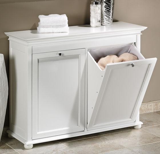
How about this unit?  It's a cabinet designed just for this and you can even go ahead and separate the colors.  When you close the bins...viola...it looks as if it's just a  beautiful piece of cabinetry.  I like it...alot!  How about you?


Here is yet another great cabinet designed to conceal your piles of laundry...this one is a little simpler in style and has bun feet on the bottom.  Quite a nice look!


Next is probably a familiar one to you.  It's the hanging laundry bag that saves floor space by hanging on the door.  Instead of having to wrestle with a drawstring top every time you want to place clothes in it...this one is made with a large embroidery hoop at the  top.  How's that for unique?  However, as for ME, I'm so Type A that I'd want my fabric to coordinate with my other fabrics in the room...how about you?  Am I crazy or what?  No, truthfully, I wouldn't choose to even have my laundry "out in the open" at all. Would you?


Add some "art" to hold your dirty laundry!  It's a wicker basket designed just for this.  Could you possibly work this into your home decor...to conceal "the pile"?


Rattan Elephant Hamper - Photo
Better yet...try this one for a child's room.  How cute is this.  I'm sure they'd even LOVE putting their own clothes in this elephant hamper...what a great way to teach them to pick up after themselves at an early age!  "Feed the elephant"...our dirty clothes...yea, that may just work!


Neu Home 3-Section Laundry Sorter - Photo
Maybe for some of you...you really don't care as much about style as you just need a little organization???  How about this triple section laundry sorter?  You can find the right spot for it, perhaps right beside your washer and dryer and then roll it around front when you are ready to wash clothes.  This would work well and at least give you a clean and organized look! 


Now, I really like this idea...colorful (or black and white) bins in the laundry room to house the piles of dirty laundry.  It's "easy on the eye" (well, fashionable!) and it's organized...what a great idea.  Problem is, for me and my family, all of our dirty laundry wouldn't FIT in these...so what's a girl to do?


Maybe this one...I really like these twin pull out cabinets in this built-in unit.  Oh, and did I mention my hubby is in the custom cabinetry business?  Should I add this to my "honey-do" list? What's your opinion here?  

But, for now, I will stick with what I have.  A laundry basket (yes, just one of those plain plastic ones - in black though) on top of my dryer.  My son also has one of these in the floor of his bathroom closet.  How about you?  Where do you hide YOUR piles of dirty laundry?  Do you have any creative design ideas for this?  If so, do tell.

Have a "Simply Irresistible" Day!


Photo Credits:  AKA Designs, Woman's Day, Houzz, thisnext.com, Birds of a Feather Design, HGTV

*I TRY TO CREDIT ALL IMAGES, IF THERE ARE ANY PHOTOS OR IMAGES HERE THAT ARE NOT CREDITED CORRECTLY OR YOU WISH THEM TO BE REMOVED, PLEASE LET ME KNOW AND I WILL GLADLY OBLIGE. THEY ARE BEING USED HERE FOR THE SOLE PURPOSE OF DISCUSSING INTERIOR DESIGN. THANK YOU!

August 16, 2011

Top Tips - #3

Let's get back to some of those "Top Tips"...design tips we use quite frequently to update or change decor.  Another great and easy way to change the look of your room is to add, or change out, PILLOWS!  Whether it's a living room, great room, or even bedroom...this will do the trick!  This is almost always a must in every design project we do.  Take a look...


Here we have different shades of blue and patterns displayed on the sofa.  Notice that the patterns don't fight one another since they blend in color and are not the same in pattern size (fabric pattern that is!).  Also added is the solid green pillow...which is an accent color.  This green picks up and carries over the green from the accessories (the apples and flower stems).  Can you tell how easy this would be to change out when you tire of these?


Here is another example of how pillows can impact a room.  Mixing colors and patterns is a great way to add more personality to a space.  I just love this color palette...what about you?


Hot off the press...this photo from the 2011 Hamptons Designer Showhouse is exquisite and the pillows are partially the reason!  I know, the headboard also punches it up a bit more, but even without that you can see how just the pillows make a dramatic statement...like they could in one of your rooms! Be bold, be daring....try it! I believe you will be amazed at the results.


Changes don't always have to be large or even expensive to create a new look.  If you didn't see our posting on "Pillow Talk" back a long time ago...you might even want to visit it.  Pillows can be custom-made or you can now even find many fabulous styles, colors, sizes, etc...in your local stores.  With today's "tip" you don't have to delay making some appealing changes in your rooms...start with new pillows.


Have yourself a "Simply Irresistible" Day!
Ta-Ta!


Photo Credits:  Traditional Home, House Beautiful, Tobi Fairley Hampton Designer Showhouse room


*I TRY TO CREDIT ALL IMAGES, IF THERE ARE ANY PHOTOS OR IMAGES HERE THAT ARE NOT CREDITED CORRECTLY OR YOU WISH THEM TO BE REMOVED, PLEASE LET ME KNOW AND I WILL GLADLY OBLIGE. THEY ARE BEING USED HERE FOR THE SOLE PURPOSE OF DISCUSSING INTERIOR DESIGN. THANK YOU!

August 15, 2011

Colorful Window Boxes

One thing I always love about visiting Charleston (SC) is looking at the lovely window boxes filled with beauty and color.  It's sort of like adding color to the inside of your home...it brightens and is a great way to say "welcome" to your guests...from the outside!  


Next time you're tempted to add some color to the outside of your home...consider designing a few window boxes.  Try a little 'Southern hospitality' no matter where you live!

Have a "Simply Irresistible" Monday!


Photo Credits: Flickr

*I TRY TO CREDIT ALL IMAGES, IF THERE ARE ANY PHOTOS OR IMAGES HERE THAT ARE NOT CREDITED CORRECTLY OR YOU WISH THEM TO BE REMOVED, PLEASE LET ME KNOW AND I WILL GLADLY OBLIGE. THEY ARE BEING USED HERE FOR THE SOLE PURPOSE OF DISCUSSING INTERIOR DESIGN. THANK YOU!

August 13, 2011

Jonathan Adler iPhone Covers

So you've seen Jonathan Adler's fabrics, textiles, furniture and room designs....right?  But have you seen these iPhone Covers in these luscious colors and patterns? Talk about eye candy...and you can carry it with you all day long! Any of them are sure to make your day a little bit brighter.  My fave, of course, is the pink and orange one!  What's your choice?


iPhone Covers
Do you have one of these?  If not, now's the time to add this stylish cover to your iPhone.  Available here.

What are you doing this weekend?
Make it a "Simply Irresistible" one!


Photo Credits:  Zhush

August 11, 2011

Designer Kudos

This week it's kudos to designer, Meg Braff, a Manhattan-based designer.  I simply adore her designs...they're colorful, fresh, unique, and classical...well, let's just say they're..."Simply Irresistible" in every way! These photos are from her very own West Palm Beach condo vacation escape.  


Aah...sunny yellows! This room is mostly white with the color being added in the rug, pillows and accent chairs. I love the way she mirrored the entire back wall, which I'm sure makes the space feel much larger and it even adds the view of the Intracoastal Waterway to the other end of the room.  Oh, and don't you love the cocktail table in here?  Using the ghost table allows her to be able to add those other two small tables without crowding the space... genius! 


What a beautiful color combo here...citrus orange and cool blue.  I love these colors together especially when used with just the right amount of white.  What a fun and happy room this is!


The dining room is mostly white, like her living room, but splashed with more yummy colors.  The artwork and table are modern and simple, yet mixed with these more traditional queen anne chairs for a great look.  


Now this truly is..."Palm Beach panache"!  Don't you just love the deep bold turquoise used in here?  Again, it is balanced with alot of white as well.  Look at how that one piece of artwork brings in the other colors as well to keep the color scheme "flowing" throughout! I simply adore this room here!  


Another look at the fearless use of color...and notice the soft curves in that sculptural cocktail table!  It actually adds a bit of "softening" to this room just because of the nice curves.  The artwork chosen for this space also pulls in the other colors used throughout, just like she did in the above room.  Once again, this sitting area is also balanced with the use of lots of white.  


OK, now you KNOW I'll be naming this room as..."Simply Irresistible"!  Of course, it's PINK (for those of you that know me by now!).  Yes, I love pink...it's my "fave"!  This is actually the beach condo's master suite.  A lovely soft shade of pink is used, not too overwhelming or bold, and blended again with lots of ... what?  WHITE, yes! I just adore this wallpaper choice too!


I certainly hope you have enjoyed taking a little tour of this beautiful and color-inspired beach condo by Meg Braff.  I hope you can see from this that bold color, or lots of colors, CAN work for you.  It can really enhance the overall personality of your rooms!  However, especially if you are unsure of this much color splash...by all means, add in the white to keep the balance!

Thanks for stopping by...

Have a "Simply Irresistible" Day!