
Happy Monday everyone! I hope you had a wonderful week-end sharing good times with family and friends. Above you will find my "addition" to our blog....a bit of simple encouragement along with our "simply irresistible" designs! Have you ever thought about "INTERIOR DESIGN" applying to our own lives (not just our homes!). Well, it does, and I have pondered this thought now for several weeks before sharing with you. Think about it...."INTERIOR" design. We have a choice to make each and every day in designing our very own "interior". So, no matter what you may be facing in your life (and let's be honest...we ALL face something!) make the decision to "rejoice and be glad" starting today! THIS will be the best "interior" design you could ever choose.....Now, for the other interior design...
Today our window treatment focus and style is on "lambrequins". A lambrequin is basically a cornice board with legs, meaning the sides are made longer to frame more of the window. Below are a few GREAT examples of a lambrequin. Notice that they can be plain and simple or have cording and trim added for that extra oomph! The legs can be made in any length, but typically are about 1/3 - 1/2 of the window height, to the sill, or even to the floor. The fact is that these fabulous creations can be made in any length and any style....that's the beauty of custom!
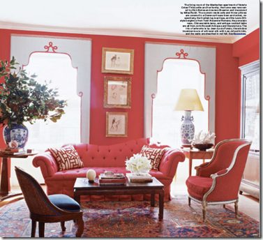
Courtesy of Elle Decor

Courtesy of Rowley Co.

Courtesy of Elle Decor
What about this great idea....a lambrequin above the closet! And I love the way it's done here with the soft fabric panel (with lots of that "bling" too!) trailing to one side. This helps to soften that whole area so nicely. It almost makes you think it was the entrance to a dressing room and not just a closet. Love it...and the colors too (yes, of course, it is, after all, PINK-my fav color!).

Courtesy of Candice Olsen
Lambrequins were actually popular back in the early to mid 19th century, where they were made with paper, wood, or stiffened buckram. This red lambrequin (below), c. 1850, is featured in the book Upholstery in America & Europe for the Seventeenth Century to World War I (1987 The Barra Foundation). Look at the intricate design and all of the details (along with the "bling") ...even way back then!

Well, that about sums it up for today! Now you know the difference in cornices and lambrequins.....so, which do YOU prefer? As you go about your week...remember to 1) HANG OUT with us often...who knows just WHAT we will take a look at next time in the world of interior design and 2) "This is the day the Lord has made"... so REJOICE AND BE GLAD in it (Psalm 118:24)....no matter what comes your way! Have a Blessed and "Simply Irresistible" day!


