August 29, 2012

Wacky Wednesday - Room Fun

Isn't is so hard to believe that summer is officially coming to an end after this weekend?  But, believe it or not, I am ready!  This is not usually the case with me.  I love summer so that I always hate to say goodbye.

In working with designs in orange and aqua, I came across this inspirational photo here.  It reminded me of something that I was discussing with one of our designers this week.  There are some room designs that we just "know" when we need to add in an element of fun.  We call it the "conversation piece in the room".  It can be 'off the wall'...as long as it works with the other designs in the room.  We LOVE it when we can do this...and we try to as often as possible...depending upon the client's style/taste/hobby, etc.  The clients always love this!

sallien:  courtesy of house of turquoise. Aqua blue accents with coral/orange armchairs and ...

I'm sure by now you know what it is in this room that caught my attention, right?  Yes, the orange and aqua elephant on the wall.  Isn't it great!!  It works, it truly does and it just makes this room (my opinion, of course).  All of the elements work well together and it gives this room a little more personality.

What elements of FUN have you perhaps added into your rooms to give it a little more flair?  Come one, share with us please! Right now, we are working with a client that loves dogs (and, has several) so we are looking at "dog fabrics" for an accent chair...yes, we really are! Oh, and in a guest bedroom...to have monkey themed art on one wall...yes, please!  A very unexpected "look" and a big hit with the guests staying over.

Thanks for stopping by and...
Have a "Simply Irresistible" Day!

August 24, 2012

Fabulous Friday Finds

Can you believe another week has rolled around again so quickly?  I just love Fridays, don't you?  I have a stunning, yet simple, "Friday Find" for you today...one that I think you will love.


Need a headboard...or a mock headboard, I should say?  Try this...

Ten Everyday Items in Unexpected Places

How about using a drapery rod and either a drapery panel or a shower curtain (yea, shower curtain, believe it or not!) behind your bed.  Voila, then you have a stunning headboard / back drop.  I really liked this one here with the writing on it...and the pop of color being so dramatic.  This makes for a good look, don't ya think?  Oh, and the best part...it's a Homegoods find.  I just love that store!

And for a little more traditional look...

How about this beautiful pleated drapery behind the bed...gorgeous!

Have a "Simply Irresistible" Friday!


Image Credit:  Homegoods/Pinterest, Traditional Home

*I TRY TO CREDIT ALL IMAGES, IF THERE ARE ANY PHOTOS OR IMAGES HERE THAT ARE NOT CREDITED CORRECTLY OR YOU WISH THEM TO BE REMOVED, PLEASE LET ME KNOW AND I WILL GLADLY OBLIGE. THEY ARE BEING USED HERE FOR THE SOLE PURPOSE OF DISCUSSING INTERIOR DESIGN. THANK YOU!

August 22, 2012

Pantone Predicts!

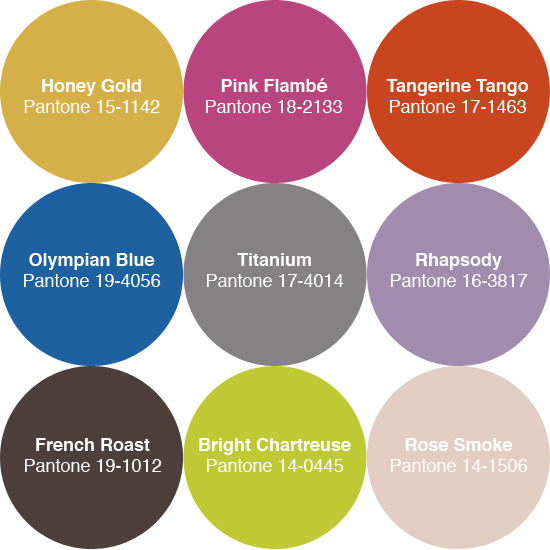
In case you missed it...here are the color predictions for Fall 2012.  We all remember that Tangerine Tango was the hot topic and pick for the color of the year, right?  Now, take a look a these other luscious picks for Fall.  I have to say, this year there are several that I adore!


So what are your thoughts?  Do you see any that you'd love to try in your home....or fashion this Fall?  Do tell, we'd love to know.

Oh and remember, if you need help getting your home ready for this new arrival (Fall, that is!) just let us know and one of our designers will be in touch!

Have a "Simply Irresistible" Day!


Image Credits:  Pantone

*I TRY TO CREDIT ALL IMAGES, IF THERE ARE ANY PHOTOS OR IMAGES HERE THAT ARE NOT CREDITED CORRECTLY OR YOU WISH THEM TO BE REMOVED, PLEASE LET ME KNOW AND I WILL GLADLY OBLIGE. THEY ARE BEING USED HERE FOR THE SOLE PURPOSE OF DISCUSSING INTERIOR DESIGN. THANK YOU!

August 20, 2012

Blue Monday!

Well, "blue" in color only!  Just a couple of beautiful blue spaces I ran across that I thought I'd share.


I could see this as a lovely office space...couldn't you?  Yes, please, I'll take it.  I love this table and the slipcovered chairs...and of course, all the blue.  Here the blues are all soft shades and then the statement is made with the...flowers...bold and beautiful!


What do you think of having the blue walls as well as the blue on the ceiling?  Like or dislike?  I like the feel it gives the room.  I also love the mix of darker wood with the whitewashed finished pieces.  It gives it so much more character than "matchy-matchy".  Don't you agree?


Here's one that has calmer surroundings (white walls) and just pops in this vibrant blue with these luscious chairs.  I really do like this look too...how about YOU?

So, for YOUR "blue Monday"...which blue photo represents YOU?

Hope your day is "Simply Irresistible"!  


Image Credits:  House Beautiful (all of these maybe, I forgot, so if I am mistaken...my apologies, and let me know so I can give proper credits!)

*I TRY TO CREDIT ALL IMAGES, IF THERE ARE ANY PHOTOS OR IMAGES HERE THAT ARE NOT CREDITED CORRECTLY OR YOU WISH THEM TO BE REMOVED, PLEASE LET ME KNOW AND I WILL GLADLY OBLIGE. THEY ARE BEING USED HERE FOR THE SOLE PURPOSE OF DISCUSSING INTERIOR DESIGN. THANK YOU!
August 16, 2012

Inbox...Aaah Moment in my Day!

I don't usually pop in twice in a day....so surprise!  I just wanted to share with you a little Aah moment I got in my Inbox just a bit ago.


Pink and White Shortbread Cookies to go.  What a nice little treat!

  And now for the recipe...


I certainly hope you enjoyed sharing in my "Inbox...Aah Moment"! It was an email I received today from Traditional Home about entertaining with a Southern Brunch...and some of these photos I just couldn't resist showing to you.  (Oh, and by the way, I absolutely LOVE shortbread cookies...and PINK ones, well they're the best!)

Have a "Simply Irresistible" rest of the Day!


Photo Credits:  Traditional Home
Photographs by Colleen Duffley

DIY Ideas

I instantly loved this idea when I saw it...


Chalkboard paint placemats

Chalk paint placemats...and then everyone knows where to sit.  Do you ladies feel a DIY project coming on?  I'm sure the instructions are somewhere floating around...help google, help!  I just love these!

Here was yet another fabulous DIY idea...

mirror turned chalkboard

A decorative mirror - spray painted in this luscious red (or any color you want!) - and then turn it into a...chalkboard!  Is this not a great look?  Oh my, another DIY'r moment, right?

Yea, yea, I know...we've all seen lots of things done with chalk paint...but to me...these are the best so far!  How about you...do you have any great DIY chalk paint projects that you've done or hope to do?  

Have a "Simply Irresistible" Day!


Image Credits:  Pinterest

August 15, 2012

Room Reveal - Client's Guest Bedroom

It's finally here...remember me telling you we'd be sharing some of our recent designs with you?  This is a first for us, in all of our twenty-six years in business, to actually share online any of our finished designs! Today is the day that we will reveal one of our completed rooms after everything was installed.

Please keep in mind, these are not professional photos...those will be shot once the new room that is now in process -yes, a different room in same house- is complete.  So, the quality of these don't truly reflect the beauty!


Just to get you up to par on a few of the details- client has blue carpet in the bedroom...dark blue at that.  The walls in here are Sherwin Williams SW6142-Macadamia.  So, our goal here was to work with the current carpet and pull in bold vibrant reds along with the blues and creams.  We wanted (and the client did too) this guest bedroom to make a statement!

We had the headboard custom made using a washable fabric - yes, a high-end vinyl (meaning, pretty).  The dust ruffle (not shown) is made out of the floral fabric.  Oh, and just so you know, our photo of the custom window treatment turned out way too dark to show, but if you can turn on your imaginations, the drapery panels (on each end of the window) are made from the stripe fabric like the euro shams in above photo...and the valance is made from the floral fabric - got it?  


We used dark stain finished nightstands on each side (that have touch lighting built in to them-nice for guests when getting up during the night!) and topped both with glass lamps in blue. It turned out very pretty - as I hope the professional photos will better show.


Bright bold and beautiful framed artwork above the bed does the trick for pulling the eye upwards and makes the room seem larger than it really is.  The reds and blues in these prints really accentuate the custom bedding well. (But again, color here in our photos are not the best!)


Our client actually already had this side chair...and every room could use a chair for it's guests, right?  We just had it recovered in the same (high-end vinyl) fabric that we used on the headboard.  This way, no matter how many guests...it stays clean.  Oh, and we just HAD to throw in this custom pillow that we had made out of this great funky patterned fabric...love it, do you?

Well, here's a shot that you can actually see a bit of the side panels on the draperies....see the stripe? Oh, and the BLUE carpet...see it?  We placed a red garden stool beside the chair...and of course added just the right accessories on top to finish it off!


This is the left side of the bed.  I wish the accessories showed up better here, but the book is blue and the vase is red glass...with red silk roses.  Just a lovely combination of red and blue!


For the custom built-in (which we also did for her to fill this space/inset she had in the room) we wanted to carry over the same colors, but to keep it very clean and simple...not too fussy.  


A little more of the details here for you to see.


Another angle of two shelves closer up.  Don't you just love those red and gold lidded boxes...they had sort of an aged look to them, but were the perfect ones to work in with all the other "pretties".


Here are the bottom two shelves of this built-in....and the few accessories we added.  We put in a great little basket so she could add some magazines for her guests. (That chair is right in front of this - positioned to the left at an angle.)


If you look closely to the left of this photo you will see the inset where that built-in bookcase is...so this beautiful piece of furniture we added sits between that and the door that opens into the room.  I thought the inscription chest would make a great guest bedroom piece of furniture.  We added a red tasseled lamp, mirrored decorative box, blue hydrangeas, mirror...etc.  If you look closely in the adorable bird mirror that sits above it, you will also catch a glimpse of the window treatments - yea!


A close-up of a few of the accessories...and the top of this inscription chest!  

Last, but not least, a better view of this mirror...and a reflection of the other side of the room.  

I hope you enjoyed seeing a room designed and implemented by the design team at Alpha and Omega Interiors.  Every inch of this room and all of the product details have been thought out, well planned, poured over, measured and re-measured, precisely ordered, implemented...as our design team always puts our "heart and soul" into each and every design for our clients...to make their home...a haven

We'll share the professional photos...and this client's other room once it's finished. (Oh, and just so you will know, we don't furnish our vendor information about products used for our design clients...as a courtesy to them.  Thanks for understanding our policy regarding this.)

Have a "Simply Irresistible" Day!


Photo Credits:  All images are property of Alpha & Omega Interiors.  Please do not copy or use without linking back to this sight for proper credit.  Thank You!

August 13, 2012

What's Inspiring Me Monday!

Did you know that "wanna-be" is not a good thing in the world of good 'ole interior design.  Why?  Because with each new day you may just find yourself "wanna-being" another STYLE all together!

My newest "wanna-be" design style (aka "inspiration") is this...

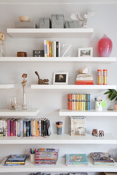
Workspaces that inspire

Beautiful straight line, crisp white shelving!  I am simply loving these enough to "wanna-be" incorporating some into my own home.  Funny thing is...this is not my style at all...but I LOVE it.  I have some amazing collectibles that I could definitely see on these.

So what's a girl to do...wanna-be this, wanna-be that...see, that's not good and maybe THAT is the very reason I have a hard time decorating for "myself" (not hard for others, just for me!).

What inspiration have YOU seen lately that makes YOU "wanna-be"?  Is it your style...or completely off the page for you?

Hope you're having a "Simply Irresistible" Day!


Image Credits:  Flickr

August 10, 2012

Forgotten? ...Never!

Hello once again sweet readers!  I certainly hope you didn't think that we forgot you...we have just been slammed with design projects of all sorts.  As you know, work comes before blog-land, so that is where we've been!  We hope to soon have some before and after photos to share, some new design image boards that are in the works, and some of the great products we'll be using...so stay tuned.

Since it is Friday (again, already!!) I thought I'd just share with you some artwork that I have been admiring for my own design project...my house!
Close this window

If you recall, my own color scheme includes Sherwin Williams "Valentine" 


and "Humble Gold" (which is SO much more yellow/gold than this shows on my resolution!)
(The color on my walls radiates the color of yellow in the above artwork-so if yours doesn't show this, then you are being deceived by technology - Ha!)

And then there is the "green monsters" I am working to move OUT of the house...and enter...turquoise blue shades (sea inspired, of course!).  Want to hear a funny not so funny story...I do not like green AT ALL...yet my house is was filled with it!!!  Why, you may ask.  Honestly, it's because my life was WAY to busy for ME when we were making selections for this home.  It was and I never had the needed focus and time to just really think (and design) something that I would be happy with in the long run.  In such a hurry as to meet the time crunches with subcontractors, and not knowing what furnishings/upholstery I would be using (i.e. NO DESIGN PLAN FOR MYSELF!!) I just gave in and picked something...even though one color was one I did not like at all....thus, the "green monsters"! 

I guess the lesson in all of this, even though I've had an interior design business for 26 years, we all need...a PLAN!  It can save plenty of money, headaches, disappointments, etc...in the long run!

So, in my mission (a slow one) that is why I've been seriously considering adding in these prints somewhere.  The colors are perfect...I love flowers...and they make me happy!  

So, what design mistakes have YOU made along the way? Are there any?  Are you in the process of making them right?  We'd love to know!

Have a "Simply Irresistible" Weekend!
Ta-Ta!


Image Credits:  Alpha & Omega Vendor Files, Sherwin Willliams

August 6, 2012

Monday Happiness

Happy Monday dear readers!  I hope you had a wonderful weekend and are off to a great start in this new work week.  I know we have been 'busy as little bees' around here with design projects...ordering fabric cuttings, wood samples, room layouts, putting together design inspiration boards, hovering over our vendor catalogs for the right mirrors and artwork, etc.....it's crazy, but we LOVE it.  

However, it was a pretty relaxing weekend, giving me time to look through magazines, both tangible and online and in doing so I found something to share with you...in case you didn't get a chance to see it.

THUS, the name of today's topic...Monday Happiness!  Doesn't THIS picture just say that?  I fell in love with this charming little house (well, it may not really be all that little!) and the lovely pink and purple blooms...and of course, that palm tree in the front yard.  It was just too lovely to not read on further...which I did.  This is the Florida home of Betsy Speert, a former designer that closed her design business to follow other passions...designing furniture, selling antiques and writing books.  


She found this lovely hat rack at an antique store...isn't it unusual?  Fun thing about this piece is that she embellished the middle of it with an image from a tambourine.  Talk about creative....who would have "thunk"  of that?


She didn't want the typical tropical Florida home so she went for a little more of a West Indies vibe.  All of the walls are wrapped with grasscloth too.  Isn't this living room a great blend of new and old?

These two chairs here were the first pieces she bought, which set the tone for the entire house...and they were an eBay find at that.

I just had to show you this close-up...I just adore it.   Isn't it cheerful?  Oh, and even these were all eBay finds.  It makes me want to go shopping on eBay....now!

Would you believe these are MORE eBay finds...oh my!  I love them all, but especially this lamp!!  I'd say she definitely now has a nice, colorful tropical flair in here.

Look how well all of her colors flow from room to room....no doubt it's the interior designer in her!!  Check out the faux bamboo detailing of this desk...and oh how I love this fabric.

Now, are you ready....where is the DIY'r inYOU?  This group of artwork here is all paint-by-numbers that she did.  What a great idea...she said it would be fun to do and it would add that little bit of "silliness" that she wanted in her vacation home.  I wonder HOW LONG it took her to do all of these?

Simplicity in this room, but look at this antique table and guess what the chandelier is made from.  Creative Betsy turned an antique drying rack into a...chandelier! 

 
I just adored seeing this bedroom here.  Such a soft color palette and I loved that it was surrounded by BIRDS.

A closer view...and another fact that I found interesting.  The bird prints were originally way to "crisp and white" for this room...so she scrubbed them with tea (sort of like tea-dying) to give them more of an antiqued feeling.  How neat is that?


And the bathroom is even in grasscloth...and I love it.  These were dark mahogany mirrors that she repainted to give them more of the tropical look.  I love how she popped the green in with plates and small pictures above (and in between!) them.   Look at this vanity chair...it fits right in with her style!

A closer view to enjoy...


As if all of that wasn't enough...this charming little bedroom just STOLE MY HEART!  First, I think I just love the fabric in here...but mixed with the grasscloth walls and the sisal rug and the right combinations of antiques, the clean white bedding, shutters on the window...ok, enough, I'll admit...it is "SIMPLY IRRESISTIBLE" in every way!!

But, HOLD ON...it gets even better.....look!
The other side of this room.  I was at a "loss for words" when I saw this...and spent the next thirty minutes, or longer. examining every inch of it!


Can you tell how well the colors flow throughout the home?  Well done!!


And then I found out that if this room weren't enough, just the way it's designed and decorated...it's right off from the POOL.  I am in LOVE, my friends!

She's thought of EVERY detail...even down to carrying the colors out here.  Look at the pool tile...and of course the cushions!  I also read that outside curtains and awnings have since been added.  If I were visiting her, I'd be back and forth...inside to outside...because that's how much I loved every inch of this tropical, West Indies feel Florida home....how about YOU?

I saved a few pictures in the article that I didn't share (believe it or not) so if you want to see more...go HERE to sign up for your FREE online subscription.  It was a web exclusive article that was in my emails.  See, I told you I enjoyed my weekend!!

Have a "Simply Irresistible" Day!


Image Credits:  Traditional Home, Betsy Speert

*I TRY TO CREDIT ALL IMAGES, IF THERE ARE ANY PHOTOS OR IMAGES HERE THAT ARE NOT CREDITED CORRECTLY OR YOU WISH THEM TO BE REMOVED, PLEASE LET ME KNOW AND I WILL GLADLY OBLIGE. THEY ARE BEING USED HERE FOR THE SOLE PURPOSE OF DISCUSSING INTERIOR DESIGN. THANK YOU!