September 29, 2012

Adding Texture to Your Room

Happy Saturday dear readers!  Hopefully you are enjoying a slower pace to the start of your day since it's weekend.  The rain in coming down, I have coffee in hand...and time to blog a bit.  What could be better?  My passion is interior design and I love working with every single client that comes our way.  Blogging is a little different "spin" on design for me since most all of our projects are truly custom in nature.  The time we spend with all of the "details" is incredible, but worth it in the end to see the expressions of our clients when they walk into their re-created finished rooms.  But, for today...I can lay aside all of those "details"...and BLOG!

I know by now you've heard and seen alot about the topic of adding texture to your rooms, right?  This can be done in many ways, but for today we will talk about one of the ways....

WITH BAMBOO SHADES


This is a great look whether in a formal room...or in a very casual room...or a fun, whimsical room. Honestly, they work just about anywhere.  So there, that will solve the question..."but will these work in my room?"  


These shades can be used with, or without, drapery panels.  I for one love the WITH draperies since it tends to look "softer".  But, either way is fine and just a personal choice really.


I really like how these shades and draperies were hung all the way up.  It adds such height and flair to the room.  So, remember to think outside the box when you install...can you mount them up higher to visually enlarge YOUR room?


In this lovely dining room, the bamboo shades are what we call "outside mounted" (meaning they are mounted outside of the window trim).  These were not mounted way up, but the draperies were installed a bit higher, which still makes the room feel higher.  Isn't this a gorgeous room, by the way?


Here is a much more casual dining nook.  These shades are actually close in color to the hardwood floors...ta da...what a great look!
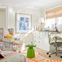
These make great shades for an office too...and without the panels.

Another room without panels...and I especially love the wicker used in this room with the shades (basket, chairs, tables - more texture!).  This room has a great overall "feel"...don't you agree?

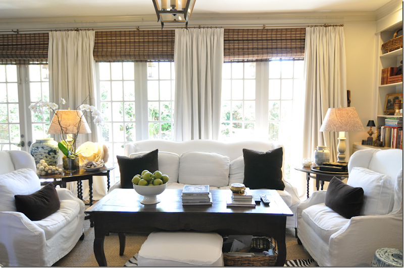
OK, enough said...now for a "Before" and "After" photo to show you just how much these lovely textured bamboo shades can add to a room...ready?

Before
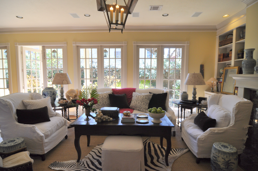

After
image


How do YOU feel about these shades?  Do you like or dislike?  Could you make this change in YOUR home to give it a new "feel"?  We'd love to know your thoughts!

Make it a "Simply Irresistible" Saturday!


Image Credits:  Pinterest,  House Beautiful, Southern Living, Houzz, BHG, Cote de Texas

*I TRY TO CREDIT ALL IMAGES, IF THERE ARE ANY PHOTOS OR IMAGES HERE THAT ARE NOT CREDITED CORRECTLY OR YOU WISH THEM TO BE REMOVED, PLEASE LET ME KNOW AND I WILL GLADLY OBLIGE. THEY ARE BEING USED HERE FOR THE SOLE PURPOSE OF DISCUSSING INTERIOR DESIGN. THANK YOU!

September 27, 2012

Cute Inspiration for Today

I saw this today on OKL and couldn't help but relate to it...

Sign Post 20x20 Outdoor Pillow, Multi

It's sort of been this way around here this week...so can you guess which way "I" would choose?  Yes, to the RIGHT, for sure!  Hum, maybe I should really get this pillow...ya think?

Hope you are having a great week...and a...
"Simply Irresistible" Day!


Image Credit:  One Kings Lane

September 25, 2012

Fall Inspired Front Entry

So tell me...are you way ahead of me this year and already have your front entry way decorated for fall?  I am getting there, cutting away summer blooms first...but I'm almost ready to add in some fall inspiration.  How about YOU?


Antique Key Fall Pumpkins


Pumpkin Wheelbarrow Arrangement


Pumpkin House-Number Sign


Porch with Monogram and Mums


Monogrammed Planter


Potted Autumn Arrangement


Harvest-Inspired Fall Front Entry


What will it be this year?  Do you go "all out" with alot...or...keep it simple?  Do tell and share some projects if you'd like!

Have a "Simply Irresistible" Day!


Image Credits:  BHG

*I TRY TO CREDIT ALL IMAGES, IF THERE ARE ANY PHOTOS OR IMAGES HERE THAT ARE NOT CREDITED CORRECTLY OR YOU WISH THEM TO BE REMOVED, PLEASE LET ME KNOW AND I WILL GLADLY OBLIGE. THEY ARE BEING USED HERE FOR THE SOLE PURPOSE OF DISCUSSING INTERIOR DESIGN. THANK YOU!

September 24, 2012

Express Makeover Monday

With the start of a new week I thought it would be a great time to start a new topic/feature on the design blog. It's called "Express Makeover Monday" because sometimes we all find ourselves in need of wanting a change around our home, yet we are unsure of just what we could do to "quickly" refresh an area...right?  Do you ever find yourself thinking this way?  Well, if so, stay tuned!  We'll try to bring you some express ways to makeover an area in your home...simply and quickly.  Are you ready?  Let's get started...

Today, let's work on a coffee table express makeover.  If you perhaps have an older more dated coffee table and are just dreaming of a new look (i.e. new table), then first let me mention a popular trend that is growing hotter and hotter every day...painting what you already have!  Yes, painting it with a color and giving it a totally new look.  It's as easy as a weekend project.  Just be sure to go online, or to your local paint store, to find out the exact treatment you'll need to use on whatever type of coffee table you have (wood, mdf, iron, etc.). You want to be sure the paint sticks to the surface...if not, yikes!  Here's an example of a painted one...


Adding a new color can totally transform your old table!  Are you up for this little DIY transformation?


Or, if you prefer, and decide you want and need a new one...then maybe you'd consider replacing your existing one with an upholstered ottoman instead.  It will then serve two purposes - 1) coffee table and 2) resting spot for those tired feet at the end of the day!  These are my new fave thing to do (not that I'm telling every client to do this - oh, but I would love to!)  in our living room designs.  Oh, and they even offer these at Target sometimes...like this one here.


Here's this look (un-tufted) - after it's "styled" of course...(which is a part of today's makeover too!)


Now, let's get to the fun part...accessorizing it for your "new look"!  A really easy way is to use a collected stack of books (design books make great ones...or any others you may already collect).  Put a few on the table (largest on the bottom) and then place a vase of some sort on it with flowers to give it a softer effect.  

Hint:  If you are indeed using an upholstered table, then use a tray to put all of your accessories on...it's easier to remove and it doesn't look as cluttered.

For Fall, try just a large bowl of fruit...like in the first photo on the red table...or fill it with things like this for another beautiful look...
Paisley Capiz Shell Sphere

Ceramic Foil Sphere

Willow Sphere

Assorted Capiz Scroll Spheres

  It's just that easy!

Are YOU in need of an updated coffee table?  Or, perhaps just some updated "styling" for the table?  Maybe so. I hope this easy makeover tip helped.

Have a "Simply Irresistible" Day!


Image Credits:  Stanley, Censational Girl, Target, Tobi Fairley, Pier One


*I TRY TO CREDIT ALL IMAGES, IF THERE ARE ANY PHOTOS OR IMAGES HERE THAT ARE NOT CREDITED CORRECTLY OR YOU WISH THEM TO BE REMOVED, PLEASE LET ME KNOW AND I WILL GLADLY OBLIGE. THEY ARE BEING USED HERE FOR THE SOLE PURPOSE OF DISCUSSING INTERIOR DESIGN. THANK YOU!

September 20, 2012

Mad About You!

A wonderful new line of furniture from one of our vendors we frequently use and I am getting to use a few pieces on some upcoming projects...ya hoo!


I am loving this Cane Bed...in this white finish!  Isn't she a beauty?

The six drawer chest (that was in yesterday's post) will be going in a bedroom we're doing.

How about this lovely Cabriole Night Stand...yes, it too was in yesterday's post to be used with the darker finish chest above.  No matchy-matchy here!

Oh, and for the dining room of the week...here it is...
Primrose Hill
I simply love every detail...how about you? Isn't this furniture grand?


An upholstered sofa too...I love the curves on the arms!

Pedestal Accent Table - love the apron details on this piece.


What about this Veranda Console?  Like?

Ok, I'm sure by now I've shown you why I'm 'mad' about this collection and the fact that I get to deliver several pieces soon.  Did you have a favorite piece?  You can go here to view more in this collection...and many more too....Enjoy!

Have a "Simply Irresistible" Day!


Image Credits:  Hooker Furniture

*I TRY TO CREDIT ALL IMAGES, IF THERE ARE ANY PHOTOS OR IMAGES HERE THAT ARE NOT CREDITED CORRECTLY OR YOU WISH THEM TO BE REMOVED, PLEASE LET ME KNOW AND I WILL GLADLY OBLIGE. THEY ARE BEING USED HERE FOR THE SOLE PURPOSE OF DISCUSSING INTERIOR DESIGN. THANK YOU!

September 19, 2012

C is for Color

How do you feel about the color gray?  Do you like gray in your rooms?  I know we see it all the time...


Kitchen islands


Kitchen cabinets

Gray counter tops
(oh, and just FYI...I LOVE this blue tile here!  Ooh-la-la...I need this!!)

Fabrics, rugs...and GRAY painted walls


And possibly we find this color on a few pieces of re-purposed furniture

So, I now need a BLOG POLL...would you buy accent furniture pieces (end tables, foyer chests, coffee tables, other accent pieces)...in GRAY?  Light or dark gray? Please take a minute to let us know as we value YOUR opinions.  A new line of furniture will soon be introduced (yes, right here on this little 'ole blog of mine) and I want to know if GRAY would be a great addition to the new paint color choices.  Come on now, let us know if it's a "yes" or a "no".  I just can't help but think that this color would possibly look stunning in just the right room!  Now it's YOUR turn...

Have a "Simply Irresistible Day"!


Image Credits:  Decor Pad, House Beautiful, Pinterest 

*I TRY TO CREDIT ALL IMAGES, IF THERE ARE ANY PHOTOS OR IMAGES HERE THAT ARE NOT CREDITED CORRECTLY OR YOU WISH THEM TO BE REMOVED, PLEASE LET ME KNOW AND I WILL GLADLY OBLIGE. THEY ARE BEING USED HERE FOR THE SOLE PURPOSE OF DISCUSSING INTERIOR DESIGN. THANK YOU!

September 18, 2012

Room Design Peek

Remember our client's red and blue guest bedroom we designed and installed turn-key recently, here?  We are in the midst of doing her other guest bedroom so I thought I'd share a sneak-peek of this room design with you today. 

Guest Bedroom

Keep in mind, we have to "pop" a little red in this room as well to keep the "flow" between these two bedrooms...and the guest bathroom that is between these two rooms (we'll share that with you later this week perhaps!).  There are two windows on either side of the bed.  The panel draperies will be on the outside of each window only...to frame that entire wall where she has the iron piece as a headboard (this was already in her room).  The bedding will be custom-made from these fabrics...however, the pillows will not be exactly as on this design.  There will be another euro sham made out of the blue bedding and then we are custom designing a bolster pillow combining three fabrics (blue, cream and a little red).  I just put this red one in for board purposes only. You can see a few other "pops" of red in this room that we will incorporate as well.  Actually, this red throw will go on a chair we are having made in yet another creamy fabric (with a leaf print) to give it a little added color.  Oh, and yes, there will be a small TV in this room for the guest so this chest will be the perfect addition for it, as well as a little extra storage in the room.  As for the artwork...we are still "playing", if you will, for the exact pieces we want to showcase.  Two choices are on the board here as possible options.  Again, it's not complete...just the "bones" of the room and the bedding.  The accessories will come last, but we'll be sure to share photos with you once it's all completely installed.

Now...for the real tangible inspiration board that we created for our client...(who is local)
As you can see...on the right side we included a few samples from the other guest bedroom that we did...and the stripe in the center is from the bathroom in between these two rooms...and all the other items were possibilities for this new room.  As you can tell, we've already changed the lamp!  She wanted to pop a little more red in this room too...which we were indeed going to do in a few accessory pieces anyway...we aim to please!  The chair will not be in this red fabric...see more on that below (just this style).

Also, here's our graphic layouts of this room that we originally presented to our client...(her carpet IS blue, by the way).

Remember, this bolster will really be out of three fabrics and have much less red on it than this one here.

The chair is this style, but will not be this white.  The exact fabric was not yet chosen when these designs were created.  It will be a creme-on-cream leafy pattern that blends well with the tones in the other cream fabric in the room....just FYI.  
Also, this wall is a bit larger than shown here and the chest will go flush against the wall (not turned as shown).  Then, our client has lots of framed pictures she wanted to use somewhere so we plan to go through them and do a gallery wall over this chest and on this wall.  Sort of like this idea below...

This will look really nice and fill in that wall behind the chair too.


Here is one of the pictures we are deliberating over using in here...just one option though.  Flowers shown on the garden seat...just for "softening" purposes on here.  


And here was the floorplan of this room to give her an idea of furniture placement.

So...I hope you enjoyed our Room Design Peek today.  We will post the full room reveal once it's completed.  All furniture, fabrics, lamps, etc are already on order so hopefully we will install everything by the end of October.  The custom items all take about 4-6 weeks...but we are excited about presenting the final products to our client...who, by the way, is an absolute delight to work with.  That makes our job even all the "merrier"!  Right?

If you'd like for us to design YOUR next room...just comment on the blog and we'll get back with you on all the details and pricing.

Here's to a "Simply Irresistible" Day!


Images are property of Alpha & Omega Interiors, except image of gallery wall by Traditional Home.

September 17, 2012

Fall Inspiration

It's that time again...Fall is in the air to stay, I do believe.  What is inspiring YOU this time of year?


Decorating Ideas for Fall
Seasonal Table Decorating

Secrets to Fabulous Autumn Style
Adding pops of Fall colors in your rooms

Pretty Leaf Pressings
Decorating Your Mantel

White Autumn
Farmhouse Style for Fall

Orchard Fruits
Decorating with other Fruits


...Or perhaps, simply this...

Pumpkin Chip Muffins Recipe
Delicious Pumpkin Chocolate Chip Muffins

And for those of you that are inspired by any Fall baking...here's the recipe...

  • Prep: 10 min. Bake: 15 min. + cooling
  • Yield: 24 Servings
101525

Ingredients

  • 4 eggs
  • 2 cups sugar
  • 1 can (15 ounces) solid-pack pumpkin
  • 1-1/2 cups canola oil
  • 3 cups all-purpose flour
  • 2 teaspoons baking soda
  • 1 teaspoon baking powder
  • 1 teaspoon ground cinnamon
  • 1 teaspoon salt
  • 2 cups (12 ounces) semisweet chocolate chips

Directions

  • In a large bowl, beat the eggs, sugar, pumpkin and oil until smooth. Combine the flour, baking soda, baking powder, cinnamon and salt; gradually add to pumpkin mixture and mix well. Fold in chocolate chips. Fill greased or paper-lined muffin cups three-fourths full.
  • Bake at 400° for 15-18 minutes or until a toothpick inserted near the center comes out clean. Cool in pan 10 minutes before removing to a wire rack. Yield: about 2 dozen muffins.


Have a "Simply Irresistible" Day!


Image Credits:  BHG and Taste of Home