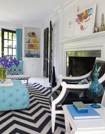
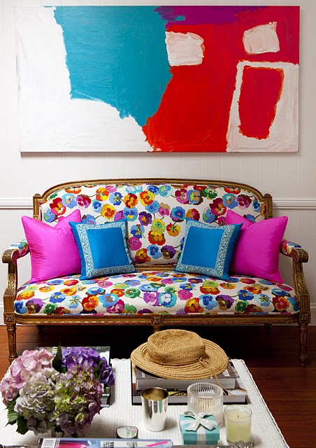
A tablescape can be best described as an arrangement of several items together to create a vignette on the top of a table. This can be done atop a dining room table, buffet, accent tables, mantels, etc. I always say, accessories are to design what jewelry is to fashion...the "finishing touch"! This is an essential element in creating the room's overall look...
Quite an elegant "flavor" for this table, don't you think?
Another elegant makeover for the table top (love those white roses too!) It's the "details" that help create this look and feel (like these great placemats and napkin rings).
Oh-la-la! More fun, yet exquisite details here!
How about this delightful tablescape using "crates" with fruit and flowers...what a great idea!
Look what just using a little bit of nature can do!
When selecting items to decorate the surface, keep in mind basic principles of design including scale, balance, rhythm and harmony. I'll share more on these later!
Symmetry used in table top decorating is one of the easiest to do-like here with the use of two matching lamps and then placing a lower (not as tall) accessory in between them. It doesn't have to be lamps as it could be greenery or even statues of art of some sort.
Here we have an example of one that is not symmetrical in design...however, it is balanced on both ends which is an important element with this type of table.
Hum...another use of 'flowers and fruit' (as in the dining room we looked at). See, this idea is even great for a coffee table. Books are ALWAYS really great to decorate with and common to find a unique accessory of some sort perched on top of them. This is a great tip when that one accessory you have is just not tall enough for balance...stack a few books under it and....Vwa-la!
Books, books, and more...BOOKS! (Notice the symmetry used on the other table too!)
Now let's take a look at decorating mantels...these are almost always the focal point of the room so you don't want to ignore this important space...it can set the tone when you walk in so be creative. You can adopt a simple style...or "snazz" it up even more to your likes.
Simplicity in style using symmetry again!
and again...along with being 'easy on the eye' with this design by Dana Lyon
...another one by Texas designer-Shannon Bowers
Now, how about a completely different look at rock artist, Sheryl Crow's, FAB mantel decor and focal point...an antique bicycle! How's THAT for creativity and bringing in a little of your own personality....love it! It just 'fits' her decor, doesn't it? And...she even has BOOKS on her coffee table...see!
Not to mention her writing desk 'table top decor'....which is "Simply Irresistible"!
Things to keep in mind for great tablescape decorating:
SCALE-is all about the right sizes for your space-be sure not to skimp...or to overload with items to large for the area
BALANCE-refers to the way in which the elements (lines, shapes, colors and textures) of a piece are arranged
RYTHYM-is repetition in your room with color, texture, etc...this brings a sense of order to your design
HARMONY-a sense of restfulness with a pleasing combination of elements blended together
I hope I have inspired you today to take a look around your home and check out the "tablescapes". Do they need some fluffing, rearranging, or maybe just some new items all together? Be sure to follow your color scheme (or just add in another "pop" of color) and create visual balance that is pleasant to the eye. Many times it is best to decorate using groups of things....in odd numbers (say 3 or 5 accessories grouped together-or more, depending on your space. Remember to have fun and experiment - move things around - then step back and take a look to determine if it is indeed 'eye pleasing' with the surroundings!
As always...we wish you a "Simply Irresistible" Day!
Photo Credits: Traditional Home, House Beautiful, Veranda, Country Living, Amanda Nisbet, Kristen Hutchins, House Decors, Dana Lyon, Architectural Digest, Shannon Bowers, Sheryl Crow, Southern Accents, and an unknown.
*I TRY TO CREDIT ALL IMAGES, IF THERE ARE ANY PHOTOS OR IMAGES HERE THAT ARE NOT CREDITED CORRECTLY OR YOU WISH THEM TO BE REMOVED, PLEASE LET ME KNOW AND I WILL GLADLY OBLIGE. THEY ARE BEING USED HERE FOR THE SOLE PURPOSE OF DISCUSSING INTERIOR DESIGN. THANK YOU!


